

Some times people say nasty things over the internet because they feel anonymous there. So lets filter out some hate.
I am going to perform Exploratory data analysis for toxic comment classification.
The datasets here is from wiki corpus datasets which was rated by human raters for toxicity. The corpus contains 63M comments from discussions relating to user pages and articles dating from 2004–2015.
Different platforms/sites can have different standards for their toxic screening process. Hence the comments are tagged in the following five categories
- toxic
- severe_toxic
- obscene
- threat
- insult
- identity_hate
You can find Dataset Here.
So without wasting any further time lets start..
First of all we are going to import important libraries that will be used during analysis.
#first we need to import required libraries
#basic libraries
import pandas as pd
import numpy as np

#misc
import gc
import time
import warnings

#statistics
from scipy.misc import imread
from scipy import sparse
import scipy.stats as ss

#visualization
import matplotlib.pyplot as plt
import matplotlib.gridspec as gridspec
import seaborn as sns
from wordcloud import WordCloud ,STOPWORDS
from PIL import Image
import matplotlib_venn as venn

#natural language processing
import string
import re    #for regex
import nltk
from nltk.corpus import stopwords
import spacy
from nltk import pos_tag
from nltk.stem.wordnet import WordNetLemmatizer
from nltk.tokenize import word_tokenize
# Tweet tokenizer does not split at apostophes which is what we want
from nltk.tokenize import TweetTokenizer


#FeatureEngineering
from sklearn.feature_extraction.text import TfidfVectorizer, CountVectorizer, HashingVectorizer
from sklearn.decomposition import TruncatedSVD
from sklearn.base import BaseEstimator, ClassifierMixin
from sklearn.utils.validation import check_X_y, check_is_fitted
from sklearn.linear_model import LogisticRegression
from sklearn import metrics
from sklearn.metrics import log_loss
from sklearn.model_selection import StratifiedKFold
from sklearn.model_selection import train_test_split
Now let us do some basic settings.
start_time=time.time()
color = sns.color_palette()
sns.set_style("dark")
eng_stopwords = set(stopwords.words("english"))
warnings.filterwarnings("ignore")

lem = WordNetLemmatizer()
tokenizer=TweetTokenizer()

%matplotlib inline
Importing the train and test dataset with pandas.
train=pd.read_csv("train.csv")
test=pd.read_csv("test.csv")
Our dataset will look like.
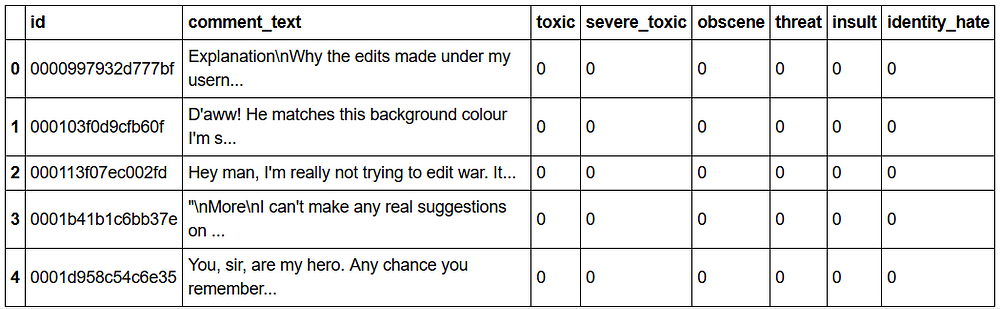
#take a look at the data i.e. train
train.head()
nrow_train=train.shape[0]
nrow_test=test.shape[0]
sum=nrow_train+nrow_test
print("             : train : test")
print("total rows   :",nrow_train,":",nrow_test)
print("percentage   :",round(nrow_train*100/sum)," :",round(nrow_test*100/sum))

Let’s take a look at the class imbalance in the train set.
Class Imbalance:
Data are said to suffer the Class Imbalance Problem when the class distributions are highly imbalanced. In this context, many classification learning algorithms have low predictive accuracy for the infrequent class.
x=train.iloc[:,2:].sum()
#marking comments without any tags as "clean"
rowsums=train.iloc[:,2:].sum(axis=1)
train['clean']=(rowsums==0)
#count number of clean entries
train['clean'].sum()
print("Total comments = ",len(train))
print("Total clean comments = ",train['clean'].sum())
print("Total tags =",x.sum())

Total clean comments without any tags.
train['clean'].sum()

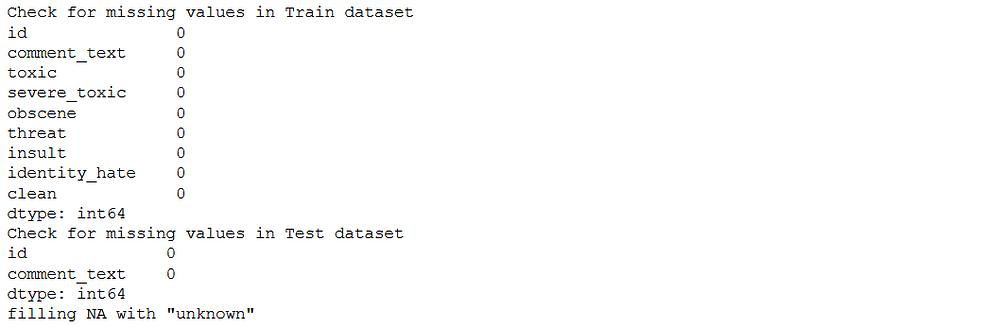
Now check missing values in Train data and Test data.
print("Check for missing values in Train dataset")
null_check=train.isnull().sum()
print(null_check)
print("Check for missing values in Test dataset")
null_check=test.isnull().sum()
print(null_check)
print("filling NA with \"unknown\"")
train["comment_text"].fillna("unknown", inplace=True)
test["comment_text"].fillna("unknown", inplace=True)
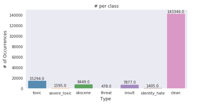
Plotting #type Vs #no of occurances
x=train.iloc[:,2:].sum()


#plot
plt.figure(figsize=(8,4))
ax= sns.barplot(x.index, x.values, alpha=0.8)
plt.title("# per class")
plt.ylabel('# of Occurrences', fontsize=12)
plt.xlabel('Type ', fontsize=12)
#adding the text labels


rects = ax.patches
labels = x.values
for rect, label in zip(rects, labels):
    height = rect.get_height()
    ax.text(rect.get_x() + rect.get_width()/2, height + 5, label, ha='center', va='bottom')

plt.show()
Verification of above graph.
toxic=train.iloc[:,2].sum()
print("Toxic:" , float(toxic))
toxic=train.iloc[:,6].sum()
print("Insult:" , float(toxic))

train['clean'].sum()
print("Total comments = ",len(train))
print("Total clean comments = ",train['clean'].sum())
print("Total tags =",x.sum())

- As from above graph we see that toxicity is not spread evenly throughout the classes so we might face class imbalance problem
- There are ~159k comments in the training dataset and there are ~178k tags and ~143k clean comments!? How??
- This is only possible when multiple tags are associated with each comment (eg) a comment can be classified as both toxic and obscene.
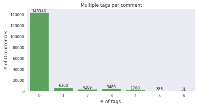
Multi-tagging in Dataset:
Let’s check how many comments have multiple tags.
x=rowsums.value_counts()

#plot
plt.figure(figsize=(8,4))
ax = sns.barplot(x.index, x.values, alpha=0.8,color=color[2])
plt.title("Multiple tags per comment")
plt.ylabel('# of Occurrences', fontsize=12)
plt.xlabel('# of tags ', fontsize=12)

#adding the text labels
rects = ax.patches
labels = x.values
for rect, label in zip(rects, labels):
    height = rect.get_height()
    ax.text(rect.get_x() + rect.get_width()/2, height + 5, label, ha='center', va='bottom')

plt.show()
Which tags go together?
Now let’s have a look at how often the tags occur together. A good indicator of that would be a correlation plot.
temp_df=train.iloc[:,2:-1]
# filter temp by removing clean comments because we don't need clean tag here
# temp_df=temp_df[~train.clean]

corr=temp_df.corr()
plt.figure(figsize=(10,8))
sns.heatmap(corr,
            xticklabels=corr.columns.values,
            yticklabels=corr.columns.values, annot=True)
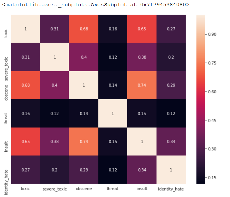
The above plot indicates a pattern of co-occurance but Pandas’s default Corr function which uses Pearson correlation does not apply here, since the variables invovled are Categorical (binary) variables.
So, to find a pattern between two categorical variables we can use other tools like
- Confusion matrix/Crosstab
- Cramer’s V Statistic
- Cramer’s V stat is an extension of the chi-square test where the extent/strength of association is also measured
# https://pandas.pydata.org/pandas-docs/stable/style.html
def highlight_min(data, color='yellow'):
    '''
    highlight the maximum in a Series or DataFrame
    '''
    attr = 'background-color: {}'.format(color)
    if data.ndim == 1:  # Series from .apply(axis=0) or axis=1
        is_min = data == data.min()
        return [attr if v else '' for v in is_min]
    else:  # from .apply(axis=None)
        is_max = data == data.min().min()
        return pd.DataFrame(np.where(is_min, attr, ''),
                            index=data.index, columns=data.columns)
#Crosstab
# Since technically a crosstab between all 6 classes is impossible to vizualize, lets take a
# look at toxic with other tags only
main_col="toxic"
corr_mats=[]
for other_col in temp_df.columns[1:]:
    confusion_matrix = pd.crosstab(temp_df[main_col], temp_df[other_col])
    corr_mats.append(confusion_matrix)
out = pd.concat(corr_mats,axis=1,keys=temp_df.columns[1:])

#cell highlighting
out = out.style.apply(highlight_min,axis=0)
out
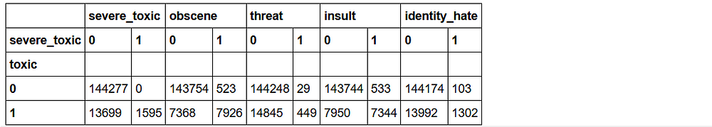
The above table represents the Crosstab/ consufion matix of Toxic comments with the other classes.
Some interesting observations:
- A Severe toxic comment is always toxic
- Other classes seem to be a subset of toxic barring a few exceptions
#https://stackoverflow.com/questions/20892799/using-pandas-calculate-cram%C3%A9rs-coefficient-matrix/39266194
def cramers_corrected_stat(confusion_matrix):
    """ calculate Cramers V statistic for categorial-categorial association.
        uses correction from Bergsma and Wicher,
        Journal of the Korean Statistical Society 42 (2013): 323-328
    """
    chi2 = ss.chi2_contingency(confusion_matrix)[0]
    n = confusion_matrix.sum().sum()
    phi2 = chi2/n
    r,k = confusion_matrix.shape
    phi2corr = max(0, phi2 - ((k-1)*(r-1))/(n-1))
    rcorr = r - ((r-1)**2)/(n-1)
    kcorr = k - ((k-1)**2)/(n-1)
    return np.sqrt(phi2corr / min( (kcorr-1), (rcorr-1)))
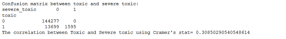
Checking for Toxic and Severe toxic.
import pandas as pd
col1="toxic"
col2="severe_toxic"
confusion_matrix = pd.crosstab(temp_df[col1], temp_df[col2])
print("Confusion matrix between toxic and severe toxic:")
print(confusion_matrix)
new_corr=cramers_corrected_stat(confusion_matrix)
print("The correlation between Toxic and Severe toxic using Cramer's stat=",new_corr)
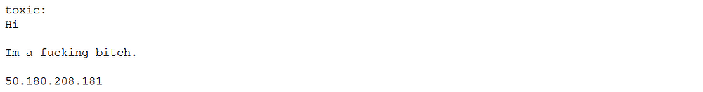
Example Comments from Dataset:
print("toxic:")
print(train[train.severe_toxic==1].iloc[3,1])
#print(train[train.severe_toxic==1].iloc[5,1])
print("severe_toxic:")
print(train[train.severe_toxic==1].iloc[4,1])
#print(train[train.severe_toxic==1].iloc[4,1])

That was a whole lot of toxicity. Some weird observations:
- Some of the comments are extremely and mere copy paste of the same thing
- Comments can still contain IP addresses(eg:62.158.73.165), usernames(eg:ARKJEDI10) and some mystery numbers(i assume is article-IDs)
Point 2 can cause huge overfitting.
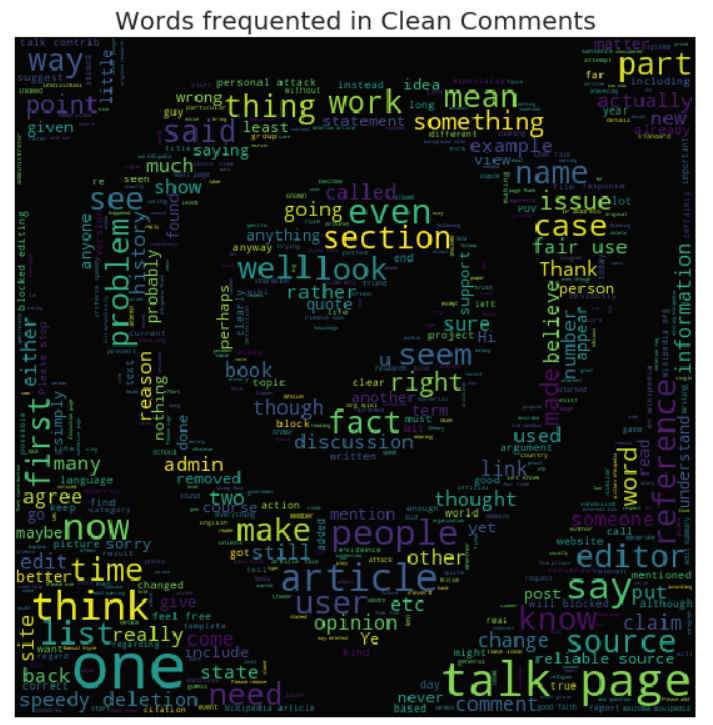
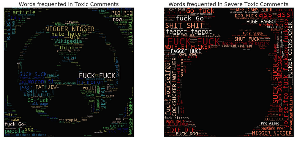
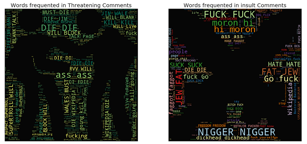
Wordclouds — Frequent words:
Now, let’s take a look at words that are associated with these classes.
Chart Desc: The visuals here are word clouds (ie) more frequent words appear bigger. A cool way to create word clouds with funky pics. It involves the following steps.
* Search for an image and its base 64 encoding
* Paste encoding in a cell and convert it using codecs package to image
* Create word cloud with the new image as a mask
!ls imagesforkernal
stopword=set(STOPWORDS)

#clean comments
clean_mask=np.array(Image.open("imagesforkernal/safe-zone.png"))
clean_mask=clean_mask[:,:,1]
#wordcloud for clean comments
subset=train[train.clean==True]
text=subset.comment_text.values
wc= WordCloud(background_color="black",max_words=2000,mask=clean_mask,stopwords=stopword)
wc.generate(" ".join(text))
plt.figure(figsize=(20,10))
plt.axis("off")
plt.title("Words frequented in Clean Comments", fontsize=20)
plt.imshow(wc.recolor(colormap= 'viridis' , random_state=17), alpha=0.98)
plt.show()
toxic_mask=np.array(Image.open("imagesforkernal/toxic-sign.png"))
toxic_mask=toxic_mask[:,:,1]
#wordcloud for toxic comments
subset=train[train.toxic==1]
text=subset.comment_text.values
wc= WordCloud(background_color="black",max_words=4000,mask=toxic_mask,stopwords=stopword)
wc.generate(" ".join(text))
plt.figure(figsize=(20,20))
plt.subplot(221)
plt.axis("off")
plt.title("Words frequented in Toxic Comments", fontsize=20)
plt.imshow(wc.recolor(colormap= 'gist_earth' , random_state=244), alpha=0.98)

#Severely toxic comments
plt.subplot(222)
severe_toxic_mask=np.array(Image.open("imagesforkernal/bomb.png"))
severe_toxic_mask=severe_toxic_mask[:,:,1]
subset=train[train.severe_toxic==1]
text=subset.comment_text.values
wc= WordCloud(background_color="black",max_words=2000,mask=severe_toxic_mask,stopwords=stopword)
wc.generate(" ".join(text))
plt.axis("off")
plt.title("Words frequented in Severe Toxic Comments", fontsize=20)
plt.imshow(wc.recolor(colormap= 'Reds' , random_state=244), alpha=0.98)

#Threat comments
plt.subplot(223)
threat_mask=np.array(Image.open("imagesforkernal/anger.png"))
threat_mask=threat_mask[:,:,1]
subset=train[train.threat==1]
text=subset.comment_text.values
wc= WordCloud(background_color="black",max_words=2000,mask=threat_mask,stopwords=stopword)
wc.generate(" ".join(text))
plt.axis("off")
plt.title("Words frequented in Threatening Comments", fontsize=20)
plt.imshow(wc.recolor(colormap= 'summer' , random_state=2534), alpha=0.98)

#insult
plt.subplot(224)
insult_mask=np.array(Image.open("imagesforkernal/swords.png"))
insult_mask=insult_mask[:,:,1]
subset=train[train.insult==1]
text=subset.comment_text.values
wc= WordCloud(background_color="black",max_words=2000,mask=insult_mask,stopwords=stopword)
wc.generate(" ".join(text))
plt.axis("off")
plt.title("Words frequented in insult Comments", fontsize=20)
plt.imshow(wc.recolor(colormap= 'Paired_r' , random_state=244), alpha=0.98)

plt.show()
I hope this post helped you in learning Exploratory Data Analysis. You can find the code used in this post at GitHub.


